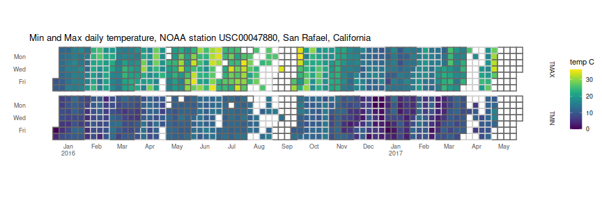
I like the calendar 'heatmap' plots of commits you can see on github user pages, and wanted to play around with some. Of course, if I just wanted to make some plots, I could have just googled around, and then followed this recipe, or maybe used the rChartsCalmap package. Instead I set out, as an exercise, to make my own using ggplot2.
For data, I am using the daily GHCND observations data for station USC00047880, which is
located in the San Rafael, CA, Civic Center. I downloaded this data as part of a project
to join weather data to campground data (yes, it's been done before), directly from
the NOAA FTP site, then read the fixed width
file. I then processed the data, subselected to 2016 and beyond, and converted the units.
I am left with a dataframe of dates, the element name, and the value, which is a temperature
in Celsius. The first ten values I show here:
| date | element | value |
|---|---|---|
| 2016-01-01 | TMAX | 9.4 |
| 2016-01-01 | TMIN | 0.0 |
| 2016-01-02 | TMAX | 10.0 |
| 2016-01-02 | TMIN | 3.9 |
| 2016-01-03 | TMAX | 11.7 |
| 2016-01-03 | TMIN | 6.7 |
| 2016-01-04 | TMAX | 12.8 |
| 2016-01-04 | TMIN | 6.7 |
| 2016-01-05 | TMAX | 12.8 |
| 2016-01-05 | TMIN | 8.3 |
Here is the code to produce the heatmap itself. I first use the date field
to compute the x axis labels and locations: the dates are converted essentially
to 'Julian' days since January 4, 1970 (a Sunday), then divided by seven to
get a 'Julian' week number. The week number containing the tenth of the month is
then set as the location of the month name in the x axis labels. I add years to
the January labels.
I then compute the Julian week number and day number of the week. I create a variable
which alternates between plus and minus one each month, then color the 'grout' between
my tiles in different gray colors to delineate the month boundaries. I then geom_tile
the values, (using viridis to get scales visible to the colorblind);
create facet rows for the minimum and maximum temperature;
add the x breaks and labels;
fiddle with the guides and impose a minimal theme;
then set the coordinates to 'fixed' to make the tiles square. Voila:
library(dplyr)
library(lubridate)
library(ggplot2)
library(viridis)


jules <- function(x) { as.numeric(base::julian(x,origin=as.Date('1970-01-04'))) }

# get weeknumber containing the 10th of each month;
aseq <- data.frame(alldate=seq(min(pltdat$date),max(pltdat$date),by=1)) %>%
    filter(lubridate::day(alldate) == 10) %>%
    mutate(moname=month(alldate,label=TRUE),wnum=jules(alldate)/7.0,yrnum=year(alldate)) %>%
    mutate(label=ifelse(moname=='Jan',paste0(moname,'\n',yrnum),as.character(moname)))

# now the plit itself
ph <- pltdat %>%
    mutate(juld=jules(date),
                 mono=month(date,label=FALSE),
                 dayname=factor(weekdays(date,abbreviate=TRUE),levels=rev(c('Sun','Mon','Tue','Wed','Thu','Fri','Sat')))) %>%
    mutate(wnum=floor(juld) %/% 7,
                 moalt=factor(sign((-1)^mono))) %>%
    ggplot(aes(wnum,dayname,fill=value)) +
    geom_tile(aes(color=moalt), na.rm=TRUE,size=0.7) +
    scale_fill_viridis(option='viridis',na.value='white') +
    scale_color_manual(values=c('gray40','gray80')) +
    scale_y_discrete(breaks=c('Mon','Wed','Fri')) +
    scale_x_continuous(breaks=aseq$wnum,labels=aseq$label) +
    facet_grid(element ~ .) +
    guides(color='none') + theme_minimal() + theme(panel.grid=element_blank()) + coord_fixed() +
    labs(y='',x='',fill='temp C',title='Min and Max daily temperature, NOAA station USC00047880, San Rafael, California')
print(ph)

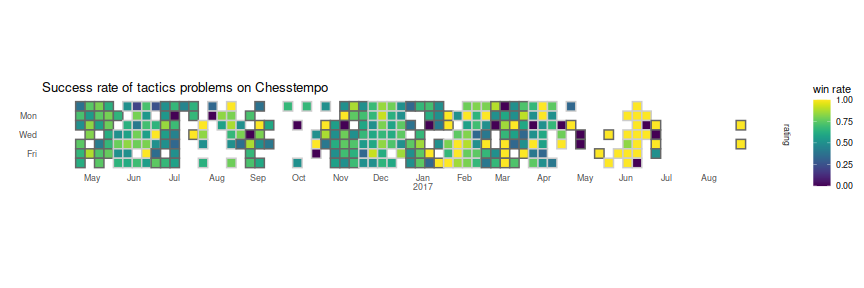
Well, that was fun. So much fun, I will run it again on my win rate from Chesstempo tactics attempts, which at least might show some weekday/weekend pattern:
