Earlier this year, I participated in the Winton Stock Market Challenge on Kaggle. I wanted to explore the freely available tools in R for performing what I had routinely done in Matlab in my previous career, I was curious how a large investment management firm (and Kagglers) approached this problem, and I wanted to be eyewitness to a potential overfitting disaster, should one occur.
The setup should be familiar: for selected date, stock pairs you are given 25 state variables, the two previous days of returns, and the first 120 minutes of returns. You are to predict the remaining 60 minutes of returns of that day and the following two days of returns for the stock. The metric used to score your predictions is a weighted mean absolute error, where presumably higher volatility names are downweighted in the final error metric. The training data consist of 40K observations, while the test data consist of 120K rows, for which one had to produce 744K predictions. First prize was a cool $20K. In addition to the prizes, Winton was explicitly looking for resumes.
I suspected that this competition would provide valuable data
in my study of human overfitting of trading strategies. Towards
that end, let us gather the public and private
leaderboards.
Recall that the public leaderboard is what participants see of
their submissions during the competition period, based on around
one quarter of the test set data, while the private leaderboard
is the score of predictions on the remaining part of the test data,
and is published in a big reveal at the close of the competition.
Let's gather the leaderboard data.
(Those of you who want to play along at home can download
my cut of the data.)
library(dplyr)
library(rvest)

# a function to load and process a leaderboard:
get_lb <- function(src) {
    is <- read_html(src)
    lbtab <- html_table(is)[[1]]
    colnames(lbtab) <- c('place','delta','team_name','score','num_entries','last_submission')
    lbtab <- lbtab %>%
        mutate(team_name = gsub('\\n|\\r','',team_name)) %>%
        mutate(team_name = gsub('‡','',team_name)) %>%
        mutate(team_name = gsub('\\*\\s*$','',team_name)) %>%
        mutate(team_name = gsub('\\s+$','',team_name)) %>%
        select(-delta,-last_submission)
    return (lbtab)
}

lbis <- get_lb(src='https://www.kaggle.com/c/the-winton-stock-market-challenge/leaderboard/public')
lbos <- get_lb(src='https://www.kaggle.com/c/the-winton-stock-market-challenge/leaderboard/private')

# get the zero prediction value, in sample
zisval <- lbis %>%
    filter(grepl('Zero pred',team_name)) %>%
    (function(.) { .$score })
zosval <- lbos %>%
    filter(grepl('Zero pred',team_name)) %>%
    (function(.) { .$score })

both <- inner_join(lbis,lbos,by=c('team_name','num_entries')) %>%
    rename(score_is=score.x,score_os=score.y,place_is=place.x,place_os=place.y)
I will refer to the private leaderboard as 'out-of-sample', or os, and the
public leaderboard as 'in-sample', or is. So here are the top ten
teams based on the out-of-sample metric:
library(xtable)
both %>%
    arrange(place_os) %>%
  select(team_name,num_entries,place_is,score_is,place_os,score_os) %>%
  mutate(score_is=signif(score_is,6),score_os=signif(score_os,6)) %>%
  filter(place_os <= 10) %>%
  xtable() %>% print(type='html',include.rownames=FALSE)
| team_name | num_entries | place_is | score_is | place_os | score_os |
|---|---|---|---|---|---|
| Just Pay your Bill's | 178.00 | 1.00 | 1698.23 | 1.00 | 1727.54 |
| Humberto Brand | 68.00 | 2.00 | 1751.05 | 2.00 | 1727.74 |
| Mendrika Ramarlina | 122.00 | 15.00 | 1769.37 | 3.00 | 1727.81 |
| Statistical_Instigator | 5.00 | 28.00 | 1769.51 | 4.00 | 1727.92 |
| anonemaus | 8.00 | 681.00 | 1770.26 | 5.00 | 1727.95 |
| Zhanpeng Fang | 3.00 | 4.00 | 1765.04 | 6.00 | 1727.97 |
| rmldj | 46.00 | 14.00 | 1769.28 | 7.00 | 1727.99 |
| fugusuki | 29.00 | 52.00 | 1769.68 | 8.00 | 1728.00 |
| vwood | 17.00 | 61.00 | 1769.72 | 9.00 | 1728.04 |
| Robson | 37.00 | 77.00 | 1769.77 | 10.00 | 1728.04 |
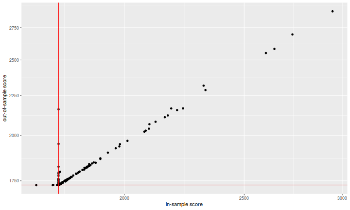
So let's see the overfitting! Here I plot the out-of-sample score versus the in-sample score. I included red vertical and horizontal lines at the scores of the 'zero predictor' on the in-sample and out-of-sample data. The 'zero predictor' is the trivial forecast that says that all returns will be zero. It is an extreme shrinkage estimate.
library(ggplot2)
ph <- ggplot(both %>% filter(score_is < 3e3),aes(x=score_is,y=score_os)) +
  geom_point() +
  scale_x_log10() + scale_y_log10() +
  geom_vline(xintercept=zisval,colour='red') +
  geom_hline(yintercept=zosval,colour='red') +
    labs(x='in-sample score',y='out-of-sample score')
print(ph)

This is not what I was expecting. At first blush, it looks like the system works: the in-sample metric is predictive of the out-of-sample metric, and there is genuine fitting here, not overfitting! But recall that the metric is designed such that smaller is better. The vast majority of what we see has performed much worse than the zero predictor, which is not a viable trading strategy. The way the metric has been designed is not helping here (and I will complain about this at great length later): if you enter your predictions using \(1.0\) to mean one percent instead of entering \(0.01\), your estimates will be inflated by a factor of one hundred, and your score (both in- and out-of-sample) will be inflated by a factor of \(100\). This plot looks great because many people wildly misestimated the volatility of these stocks or didn't try basic shrinkage.
Another oddity is that there appears to be a large number of teams who achieved an in-sample score around the zero predictor, but performed much worse in the out-of-sample. There are two possible interpretations: one is that since teams need not use their best-performing (based on the in-sample data) predictions for their final scoring (i.e. the out-of-sample metric), yet we are seeing the best in-sample score on the \(x\)-axis, these teams submitted a suboptimal final model. The other interpretation is that these teams somehow discovered the split between in-sample and out-of-sample test data (towards what end, I am not sure.)
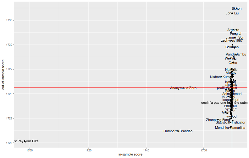
So let us zoom on the 'plausible' teams, those performing not terribly worse than the zero predictor on the in-sample period:
library(ggplot2)
ph <- ggplot(both %>% dplyr::filter(score_is < 1.001 * zisval,score_os < 1.001 * zosval),
    aes(x=score_is,y=score_os,label=team_name)) +
  geom_point() +
  scale_x_log10() + scale_y_log10() +
  geom_text(check_overlap=TRUE) +
  geom_vline(xintercept=zisval,colour='red') +
  geom_hline(yintercept=zosval,colour='red') +
    labs(x='in-sample score',y='out-of-sample score')
print(ph)

Fitting or Overfitting?
It is hard to see this as solid evidence that the in-sample metric is predictive of the out-of-sample metric. There are two teams, Just Pay your Bill's and Humberto Brandão, that seem to have dominated in the in-sample and out-of-sample periods. A third, Anonymous Zero, performed significantly better than the rest of the pack on the in-sample period, but not in the out-of-sample. Did they learn something, or have they overfit?
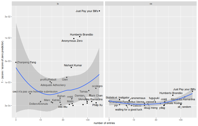
To check on this, here I compute the ratio of the team's score to the score of the zero predictor, then plot one minus the ratio versus the number of entries, for teams sufficiently better than the zero predictor. The idea is that we should see 'fitting' by looking for an increase in the in-sample period versus number of entries. 'Overfitting' would show up as a decrease in the out-of-sample period with respect to entries.
library(tidyr)
# convert to ratio to the zero predictor:
bscat <- both %>%
  mutate(ratio_is=score_is/zisval,ratio_os=score_os/zosval) %>%
    select(-place_is,-place_os,-score_is,-score_os) %>%
    gather(key=period,val=ratio,-team_name,-num_entries) %>%
  mutate(period=gsub('ratio_','',period))

lambda <- 0.9997

library(ggplot2)
library(ggrepel)
ph <- ggplot(bscat %>% filter(ratio < lambda),aes(x=num_entries,y=1-ratio,label=team_name)) +
  geom_point() +
  geom_text_repel() +
  stat_smooth(span=1.0) +
  scale_x_log10() + scale_y_log10() +
  labs(x='number of entries',y='1 - (score / score of zero predictor)') +
  facet_grid(. ~ period)

print(ph)

There is definitely a 'fitting' effect visible here. One suspects that a small handful of teams--perhaps five to ten--were very effective at optimizing the in-sample metric. When viewed as black-box optimization problem, the number of iterates is still small enough that these teams have done a fairly good job at reducing the parameter space, and of incorporating the scoring information. It is not clear from the out-of-sample plot that they have fit or overfit. So here I grab teams who performed strictly better than the zero predictor in the in-sample period (there are 407 of them), and compute the correlation of scores on the in-sample and out-of-sample periods. Below I tabulate the Kendall and Spearman correlations. These are higher than I had expected. If you further filter to those teams that made at least 20 entries (there are 145), the correlations are much lower. This should be no surprise: if you select models based on an unbiased metric, it is no longer an unbiased estimate.
both %>%
    filter(score_is < zisval) %>%
    summarize(kendall=cor(x=score_is,y=score_os,method='kendall'),
        spearman=cor(x=score_is,y=score_os,method='spearman')) %>%
    kable()
| kendall | spearman |
|---|---|
| 0.219 | 0.259 |
both %>%
    filter(score_is < zisval,num_entries >= 20) %>%
    summarize(kendall=cor(x=score_is,y=score_os,method='kendall'),
        spearman=cor(x=score_is,y=score_os,method='spearman')) %>%
    kable()
| kendall | spearman |
|---|---|
| 0.074 | 0.078 |
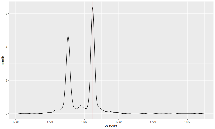
One last interesting (to me) plot. I grabbed teams who performed reasonably well in both the in-sample and out-of-sample periods. I then plotted the empirical density of their out-of-sample scores, with a red vertical line at the zero predictor. The data are indeed bimodal, with some cluster of extremely shrunk predictions around the zero predictor. I am not sure what causes the second cluster of lower scores. Perhaps something to do with the estimating the 'DC level' of whole market returns over the test period, or somehow caused by the split of the metric along the minutely and daily divide. I do not know.
library(ggplot2)
ph <- ggplot(both %>% filter(score_is < 1.001 * zisval,score_os < 1.001 * zosval),
    aes(score_os)) +
  geom_density(adjust=0.4) +
  geom_vline(xintercept=zosval,colour='red',show.legend=TRUE) +
  labs(x='os score',y='density')

print(ph)

The Metric
I spent some years using 'machine learning' to look for systematic strategies. One lesson
I learned repeatedly is that some ML techniques, especially those that involve some kind of
automated search, are fantastic at revealing problems with the design of your metric.
For example, if you optimize on backtested Sharpe, but computed on a per-leverage basis,
you might compute NA because sometime strategies are out of the market; so you
compute a NA-proof Sharpe; but then you start finding strategies which have only been in the
market for five days in the backtest period, and so on. Each fix reveals a new problem, and
it becomes a game of data hacker Whack-a-Mole.
While not terrible, the WMAE metric used by Winton has one of the familiar problems of bad metrics: it is not terribly well aligned with the metric of success in trading. For example, the contemporaneous returns of stocks are jumbled together in the metric. A statistician might complain that the errors are not independent, but to the practitioner the problem is that constraints on capital might mean you cannot reap the rewards of better predictions under this metric. For example, if you somehow had a decent market timing model, and forecast the (beta adjusted) market return for each stock, the WMAE might be great, but returns of the market timing model not so much. The invesment problem is a portfolio problem. Contemporaneous returns are correlated, and the value of your predictions is not independent of random rearrangement of the true timestamps.
Another problem along the same lines is that the WMAE metric accepts insane predictions with a straight face. Thus in the first plot it looks like we have very high (Pearson) correlation between scores in the in- and out-of-sample periods. Indeed we do, because some forecasts are quite insane: too large probably by several orders of magnitude, they might result, depending on your trading strategy, in much too high or much too low leverage. Perhaps a safer way of turning these predictions into portfolios would affinely transform the predictions into portfolios with zero net leverage and unit gross leverage, say. A result of this default transformation is that the metric of success is then a directional one, and should be invariant with respect to positive rescaling of the predictions. The WMAE clearly does not have this property. Furthermore, it is not clear why it shouldn't have this property-- perhaps if one were engaging in market timing or predicting volatility, it would make sense to break this invariant.
However, in order to do that, the contest organizers would have to given the timestamps of the rows and perhaps the IDs of the assets. This would have required a bit more explanation of the data, and might have opened the door to reverse-engineering their data (and thus hacking around the metric). As it was, there was apparently a boo-boo with the split between training and test data: at some point in December, Kaggle changed the training data set, resulting in a big change in the (at that point in-sample) leaderboards. From what I can gather on the discussion boards, there may have been some leakage between the training and test data. That is, note that the training data gives you five days of consecutive returns for a given stock (the middle one is broken down into minutes), while in the test set you have two and two thirds days of returns. If you could line up two days of returns in the test set with two days of returns in the training data, you would have really good predictions for those rows. Again, this is pure time travel, something that is much easier to simulate than implement in systematic trading.
While I am grousing, I should note that the decision by Winton to keep the state variables anonymous was a bit disappointing, although not surprising. I am not an ML cheerleader: I believe that machine learning without domain knowledge is a Bad Idea. If you know something about the world, you should probably use it to your advantage. On the other hand, keeping the state variables anonymous is highly consistent with the putative Kaggler view that data is king and beliefs are irrelevant. So maybe I'm just an old crab.